Control the chaos and unleash your team's potential with Extensis Connect / Learn More
Control the chaos and unleash your team's potential with Extensis Connect / Learn More
Creating a Brand Style Guide Series is written by Pariah Burke, consultant and trainer for creative, publishing, and editorial professionals.
Your logo, the harbinger of your brand and without a doubt the most crucial of your brand assets, must be protected through strict usage rules. What are those rules? Where and when do they apply? How do you best communicate those rules for consistent, controlled representation of your brand herald? You’ll answer these questions—and more in Creating a Brand Style Guide, Part 2: “Defining and Communicating Your Logo Uses.”
In Part 1, we defined what brand means and how important it is to define a framework for the consistent, controlled representation of that brand in all media.
Few assets are as important to your business as your logo. Creating the mark that will be the harbinger of your brand goes far beyond having a great design. Ensure it’s protectable by investigating its uniqueness as an identifying mark in your area of business. Original logo artwork may be protected through copyright, but when a design identifies a brand, as your logo does, trademark protection is far more important that copyright. Your logo must be unique and dissimilar from any other trademark or service mark used within the same class or classes of businesses. If it isn’t, you will be infringing on another trademark or service mark. Copyright allows owners to go after infringers and to license some or all rights to the copyright protected material to be used by, or become representative of, other entitles. Trademark law, however, obligates mark holders to aggressively defend the uniqueness and unapportionable nature of their logos and other marks. Failing to properly vet your logo in the marketplace could cause you to lose all rights to it—and worse.
Learn more about protecting your digital assets. Download our free Digital Asset Management Best Practices Guide.
Before you build a brand style guide for a new or recently changed brand, engage an intellectual property to ensure the originality of your logo and other protectable brand elements. Trademark law falls under the domain of the U.S. Patent and Trademark Office. As such you’ll usually find attorneys who specialize in trademarks listed under “patent law.”
No matter your plans right now, a logo has to be ready for usage in all media. Today, no brand is single media, and who knows what tomorrow will bring. Prepare and store your logo in common color depths to be ready for whatever usage may come about. That starts with having versions ready for environments with different color models, in all the official corporate colors.
The bare minimum selection of formats to prepare is a black-and-white version for places where color, or more than a single color, isn’t possible; an RGB version for the Web and other digital uses, and; a CYMK version that uses print-ready, process ink colors any printer can reproduce faithfully on printed materials. Ideally you should also add greyscale and spot color versions. By using tints, greyscale can present the logo with more visual interest than black-and-white where only a single color is possible. Moreover, that single color needn’t be black; if you have the option, presenting a single-color logo in tints of an ink other than black can have a dramatic impact over always choosing black. Greyscale is merely tints of black, and black can easily be replaced with blue, red, or any color, resulting in shades of that color instead of shades of black. For reasons that will become clear in Creating a Brand Style Guide Part 3, “Establishing Consistent Brand Colors Across Media,” you should create a spot color, or Pantone color, version of the logo that uses specific, premixed ink colors for ideal representation in ink- and dye-based media such as offset (standard paper) printing, screen printing, product manufacturing, and other such processes.
Now create versions of the logo with colors remixed for use on dark backgrounds. Unless you’re very lucky, the colors you’ve chosen for the logo will need to be adjusted to stand out on black or other dark backgrounds. At the least, you’ll need a white version of the black-and-white edition. Have those ready as well.
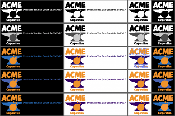
For logos that are primarily single-color, consider making versions that are different colors, or different shades of the primary corporate color, for use on different background colors. Also consider whether the logo might be placed atop other specific colors regularly, and create versions that work best with those background colors. Figure 2 shows an example of a single-color logo prepared for use across the others a brand might employ for different uses.
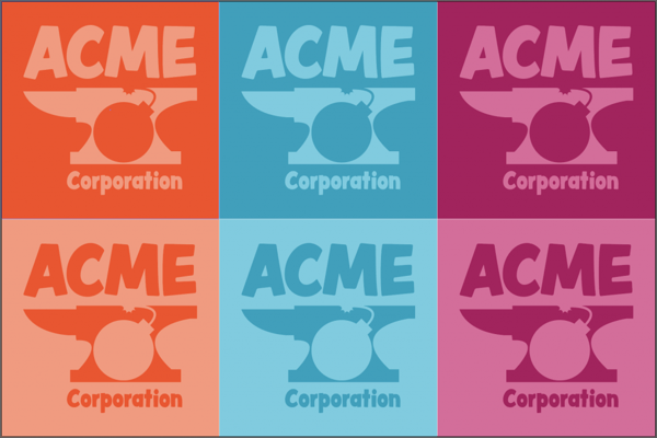
Some designers might consider this type of preparation a waste of time. After all, why not just have the basic versions of the logo and then change its colors as needed from project to project? That’s exactly why you must do it all now; logo colors changing from project to project is what we don’t want. It weakens the brand style. Creating a consistent, controllable presence is the entire point of branding. The function of the brand style guide is to directly communicate the allowed uses of brand elements and, through omission, the disallowed uses. When creating the brand style guide you must include every acceptable form of the logo; anything left out is, by definition, unacceptable.
Now that you’ve created all the versions and styles of logos allowed to represent the brand, it’s time to get those into file formats ready for distribution and use in common media. Consistent use of the logo is easier to maintain if the people who might use the logo are provided a standardized selection of digital assets with which to present that logo. For example, keeping the logo in the right colors and at the appropriate size is easy when the marketing department only has to grab a pre-created PNG file to drop into PowerPoint, and that same PNG is used by the Web design team for the email newsletter. Preparing a comprehensive selection of grab-and-go logo assets now saves not only off-brand improvisation by whomever needs to use a logo for which there is no ready asset, but also the constant plague of asset creation requests to designers.
Logo assets should be created and made available for the most common media in which the brand may participate, and in a selection of sizes and color depths appropriate to authorized uses within each media. Below we’ll talk about distributing logo assets; for the moment we’re concerned with creating them.
In what mediums will your logo be used? Print, certainly—business cards, letterhead, and other printed collateral is essential to any business. Then there’s the company website and social media accounts. Is there a company YouTube or Vimeo channel? Are there any plans to produce tutorials for the website, marketing department, or for internal or partner training? Will anyone be producing eBooks? Are billboards a possibility? How about textiles such as t-shirts, canvas bags, or other such physical items?
These uses must be planned for by creating logo versions in media-correct colors and by providing the agents who will carry the brand into such uses with ready-made digital assets. Assets must also be in the correct formats for each medium.
Resolution-independent vector assets are the path to pursue for logo use on physical materials. Everything ranging from business cards to billboards, product packaging to t-shirt design, car wraps to convention booth displays, is best served with vector assets in either Adobe Illustrator .ai, vector PDF (typically created from Adobe Illustrator), or EPS formats. Be sure to embed all dependencies in the vector files. For elements that include editable type, you will want to leave text as live type and, distribute fonts to your team with Universal Type Server or Suitcase TeamSync. For assets that may need to be distributed externally, and don’t include editable text, it is advisable to outline text that is in brand-specific typefaces to prevent font substitution. Produce vector assets for versions of the logo with and without the tagline and in black, white, greyscale and other single-color tint versions, and CMYK and spot color versions in all approved color combinations. Depending on the design of the logo and typeface used within any text, you might also want to design and have assets ready for logo versions built specifically for lower resolution media such as screen printing and some forms of product packaging.
The latest tips and tricks to managing your organization’s fonts are here. Download our Server-Based Font Management Best Practices Guide.
For most brands, non-moving digital media is where the logo will see its most frequent use. From the website to the various social media profiles, slide decks to photo watermarks, reflowable EPUB to fixed-layout eBooks, and so many potential other uses will need pixel-based digital assets. Not only will you need to prepare black, white, single-color tint versions, and full-color RGB versions, you’ll also need to provide them at a number of different sizes to account for the fixed-resolution nature of pixel-based, raster imagery. Examine the expected digital uses of the logo carefully in light of the relative size at which you want the logo represented in all media. Some media have set specific sizes; Twitter, Instagram, and Facebook avatars, for instance, are fixed sizes at which you’ll need to build PNG, JPEG, or GIF files. In other locations, like the website and publications produced by and for the brand, however, the sizes are open to your determination. You’ll need to figure those out now. Once you do, create raster images of the correct logo version, or versions, for those uses. Try to create your raster image logo assets as 24-bit PNG images with transparent backgrounds for the most flexibility. Then, create a few more versions at common sizes for rapid deployment where you haven’t anticipated. You might want to make logos that fit within the following sizes: 100, 256, 512, and 1024 pixels wide.
Motion and video are the direction in which social media and marketing are moving. If it isn’t already, video may soon become a part of your brand management presence. Be prepared for that by preparing video-ready logo assets. These can be as simple as PNG images with transparent backgrounds or as complete as entire video or animation clips. If the former, create the usual black, white, and single-color tiny versions as well a full-color RGB versions that comply with acceptable video color palettes. Make large versions for full-screen branding, small corner overlay, or “bug” versions, and yet smaller editions for use in lower-thirds—those bars that appear beneath people’s images on video conferencing or when being interviewed on the news. Motion versions of the logo created in video editing, animation, or 3D rendering applications should be ready in several standard video sizes—widescreen 6:9 and standard 4:3 aspect ratios, at 720p, 1080p, and HD—and in the standard video format of lossless MPEG-4 with H.264 encoding.
With all your logo assets created, you’ll need to distribute them so that they’re available to your entire team, remote contractors, and vendors. The easier it is for someone to locate and access the correct logo asset, the less likely that person will be to improvise a use from an incorrect asset that is more easily reached.
Brand assets change over time, so not only is it important that you make them available to agents who will use them, you also need to be able to remove outdated assets to prevent their future use. For that reason, you need a digital asset management (DAM) system (see Figure 3).
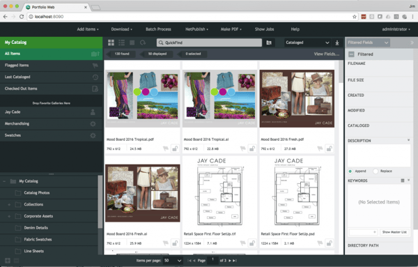
By organizing and sharing your digital assets via Extensis Portfolio, Adobe Bridge, or another digital asset management solution you can control who has them, and who has which versions of them. As outdated assets are replaced or retired, they can be removed from the shared location and replacements pushed to agents. Portfolio, for instance, can share assets to in-house team members and remote contractors through easy to access clients. Alternatively, assets can be shared to team members as well as to vendors, partners, the press, and even the public through Portfolio Netpublish, which makes your assets available in any web browser on desktop via dynamic websites. You can share all your brand assets with everyone, or share only specific files or sets of files with different groups of people. Temporary relationships and limited lifespan documents and sets of approved assets are accommodated easily by automatic expiration of shares.
Another highly useful feature of Portfolio is on-demand asset conversion. Instead of creating all those different size, resolution, and file format assets I mentioned above, you can dramatically streamline your set of digital files by storing full resolution original like Photoshop PSD and Illustrator AI files on the Portfolio server and enabling Portfolio to generate the size, resolution, and format required by team members as they need it.
A DAM will also manage metadata so that, for most file types, you can include right with the file the correct usage guidelines, which we’ll talk about below.
Regardless of the DAM system you employ, even if it’s as simple as sharing folders via Dropbox, Box, or Google Drive, make sure you make it easy for necessary personnel inside and outside your organization to access the correct versions of your brand assets, in the correct colors, formats, and sizes, when and where they need them.
With your logo’s digital assets created and available to your team, you’re half done. Now you have to tell anyone who might use your logo how to use it. It’s important to define unequivocal rules for the placement and positioning of your logo in various uses as well as the correct versions to use in specific situations and media. After all that work creating different size and color versions, you don’t want an agency ignorantly using the wrong one. Nor do you want someone placing your logo so close to other page elements that the logo is difficult to distinguish. Neither should be a problem with well-defined and clearly communicated logo usage guidelines.
Decide logo usage guidelines by answering the following questions.
Continue along that track. Ask yourself: “…if you had absolute control over every possible use of your logo and every other brand element, how would you want those elements used.” Now realize that you do have that absolute control, and it’s your responsibility to exercise that control.
Write down the answers to all of these questions. These are your logo usage rules and guidelines. Determine the best way to communicate them to agents who might use your logo. For many of the guidelines, the best way to communicate them is in concise written rules; for others, a more visual approach may be better. Figure 4, for example, shows a way of presenting the minimum allowed space around the Acme Corporation logo to keep it separated from other elements on the page. Note that there are no exact measurements. You won’t find inches, pixels, or millimeters because there’s no way to know at what size the logo itself will be set. Instead, use relative measurements, something also visual, such as the capital C whose height is also relative but established the logo itself.
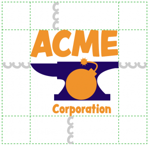
You could take it even one step further, reducing even more potential confusion, by providing code and specific examples where possible. For example, to place the Acme Corporation logo in HTML or reflowable EPUB eBooks, the following CSS would provide separating white space around the logo if the logo image was assigned the ID “logo” in the HTML code. The unit em is relative, so these measurements would adapt well to any properly written CSS and HTML. More importantly, they establish the relationship between logo width and spacing (margin); to enlarge the width, enlarge the margin commensurately. CSS also scales proportionately, so by providing a width measurement, the height will automatically scale at 1:1 without the need for also specifying the height. The margin property will apply the 1.5 em measurement to all four sides—top, right, bottom, and left—without the need to call out each explicitly.
#logo {
width: 6em;
margin: 1.5em; }
In the next installment, Part 3: “Establishing Consistent Brand Colors Across Media,” we’ll explore choosing your brand colors for use in print, on the Web, in ePUB and fixed-layout ePUB, video, and other media. We’ll how to choose your colors, which, I’ll give you a hint, is decidedly not on a computer screen. Colors vary across mediums. Process printing, for example, has a very small color gamut, or range, of available colors, and each color that is available is made with a combination of one or more of cyan, magenta, yellow, and black. Their possible combinations leave out thousands of shades that are possible on computer and television screens. Translating between the two for close-as-possible matches is possible with the right tool. Even the same colors that work on most screens are expressed differently, written using different formulas, in different media. Your brand style guide must communicate your brand colors in a number of different formats to ensure fidelity across media and from agent to agent. In “Establishing Consistent Brand Colors Across Media” we will do that as well as employ a few simple strategies to make it as simple as possible for team members, contractors, partners, vendors, and the press to use the right colors when working with your brand.
Pariah Burke (Twitter: @iampariah) is a consultant, trainer, speaker, and the author of numerous books, video courses, and articles covering InDesign, InCopy, Photoshop, Illustrator, Acrobat, typography, asset management, epublishing, and the business of design. He is an Adobe Community Professional, an Evernote Certified Consultant, and an advisor to Adobe and other companies. He lives in Portland, Oregon.